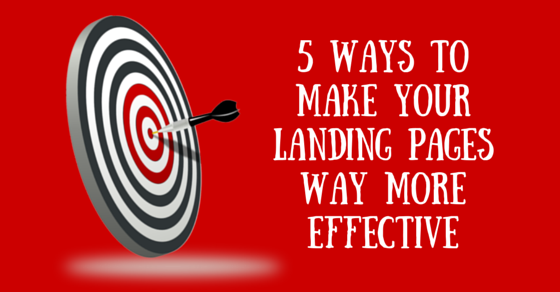
5 Landing Page Conversion Tips
Why Do You Need a Landing Page? What Should Be Your Landing Page Strategy?
First of all, what is a “landing page”?
(If you know the answer to that, and you have made landing pages already and just want conversion-boosting tips, skip down a few paragraphs. Otherwise, keep reading here.)
Did you ever click on an advertisement in Google and get taken straight to the advertiser’s homepage?
Big no-no. (For the advertiser, not for you. You can click on any ad you want.)
If you are running a digital marketing campaign – whether it is ads on Google, Facebook, or spreading the word via social media – you want to send visitors to what’s called a “landing page,” NOT your home page. A landing page is a special page designed for the sole purpose of getting visitors who come through a specific marketing campaign to perform a particular action: buy, contact you, sign-up, etc. They click on your ad, “land” on this page, and hopefully don’t leave before they accomplish your goal or complete your call to action.
For that reason, the landing page needs to be very strategic. You went to all the trouble of identifying, targeting and motivating your ideal client, right? And they clicked through to your site (success!) Don’t waste their visit to you!
Give your potential client all the information she needs to accomplish your goal – and don’t give her anything else that would distract her. If you run an exclusive, high-class guinea pig grooming spa, and you want your site visitors to contact you in order to book a stay for their precious guinea pig, send them to a landing page that is targeted toward people who have already decided to vacation and are debating about what to do with their darling pet while they are away. Describe how you have a staff member dedicated to each and every pig, how their beloved pet will be munching on gourmet organic vegetables, how his paper shavings will be changed twice daily. Give testimonials from enthused (deranged?) pet owners who have boarded their guinea pigs with you. Talk about your special Book 3 Nights, Get the 4th Free offer. End with a contact form or a live chat option to speak to a representative.
That’s very focused on the goal, right? Your goal is to book guinea pig spa visits – you targeted the right audience and pitched them your product effectively.
But if you send them to your homepage, they will have too many options. They may decide to click on your Guinea Grooming Guide – or check out the recipes in your Gourmet Guinea Goodies section. Will they notice your testimonials page in the main navigation menu? There are WAY too many places they could get distracted and end up leaving your site without seeing the information you want them to see – and taking the action you want them to take.
So you need a landing page for each advertising campaign.
Once you have a landing page – or better yet, once you’re designing a landing page – how can you maximize the effect so that your visitors will take the action you want them to take?
Here are 5 tips to make your landing pages as effective as possible:
1) Eliminate any unnecessary menus, sidebars, or links
Remember our guinea pig example? What was the problem with the homepage? It’s distracting! So you want to remove any and all distractions from your landing page. Make it easy for your potential client to get the information he needs, take action, and get out. If your main navigation will take him away from that (“Hmm… I could contact them, but maybe let’s check out their blog…”) – take it away! Either you or your developer should be able to create a page template with your header but no navigation bar. (If you are developer-less, run WordPress, and want instructions on how to do it yourself, drop us a line in the comments below. We can arrange a future post on the topic.)
If your goal is for your visitor to contact you, take away the sidebar with your newsletter sign-up form. Adding email addresses to your database is an accomplishment, yes – but not at the expense of your real goal (immediate conversion.)
This does not mean you MUST take off every spare pixel aside from your marketing copy. If having the main navigation will help them appreciate your site and offerings more, leave it. Just make sure that there was an informed decision made.
2) Testimonials
Otherwise known as “social proof,” otherwise known as “mob mentality”, otherwise known as “if everyone jumped off a bridge” … well, maybe that’s a little extreme. But we human beings are social creatures, and we look to see if other people are doing something before we do it. If there is proof that many people, discerning people, people we relate to are doing it, chances are we will do it too. If I see that other people trust you, and why, it increases the likelihood that I will trust you.
3) Lots of text
Make your pages long. Imagine that you’re selling your product face-to-face. Write down what you would say – maybe even record it. Get all that information onto your landing page. After all, in a face-to-face sales meeting, you get to answer their questions and objections. On a web page, they may not stick around if there are questions and objections. Try to preempt them. Don’t worry about boring people with all your text. If people are interested in what you’re saying – they’ll keep scrolling. Just make it relevant and captivating – and make sure they realize there’s more information.
4) Repeated calls to action
This tip goes hand-in-hand with the last one. Especially if you have a long page, give them multiple times over the course of reading the page to perform the desired action. Have your “call-to-action button” (where it says “Get Your Free Quote Now” or “Sign Up Today” or “Start Your Free Trial”) after every section of your text.
5) Make the decision “Which”, not “If”
Be careful how you word your offers. When the guinea pig owner sees “Contact Us for Boarding Details,” the decision is whether or not to call. As soon as your guinea pig owner sees a “Which Boarding Plan is Right For Your Pet?” table, with options for “One-Time Stay,” “Yearly Plan” and “Timeshare,” the decision becomes more about “Which option do I pick?” instead of “Should I go with this provider or not?”
Bringing the Tips to Life
One good example of most of these tips is http://diythemes.com/ – the Thesis Theme page for WordPress. Ironically it is actually a homepage, but it’s super-targeted and well-designed – with lots of text and multiple calls to “See Which Thesis Option Is Right For You.” Down by the bottom they show all the movers and shakers who use Thesis.
One fantastic resource for conversion tips on landing pages is the Conversion Rate Experts website. Case studies, articles – well worth a read to get your conversions up.
 Submitted by Aviva
If any of these changes get your conversion rates up, share your successes with us in the comments.